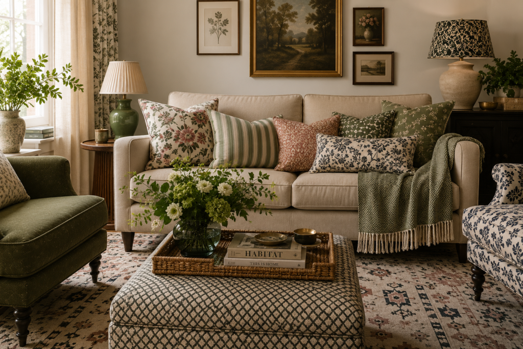
How to Mix Patterns Like an Interior Designer
Mixing patterns is one of the easiest ways to add personality, warmth and visual interest to your home. Whether you love timeless florals, bold geometrics or classic stripes, combining different prints can transform a room from feeling flat to feeling thoughtfully layered.
The key is balance.
Many people worry that mixing patterns will make a room feel chaotic or overwhelming, but by following a few simple principles, you can confidently create a space that feels stylish, cohesive and uniquely yours.
Here’s how interior designers approach pattern mixing:
Start with a Balanced Colour Scheme
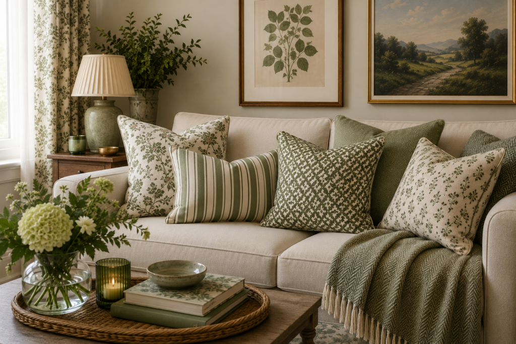
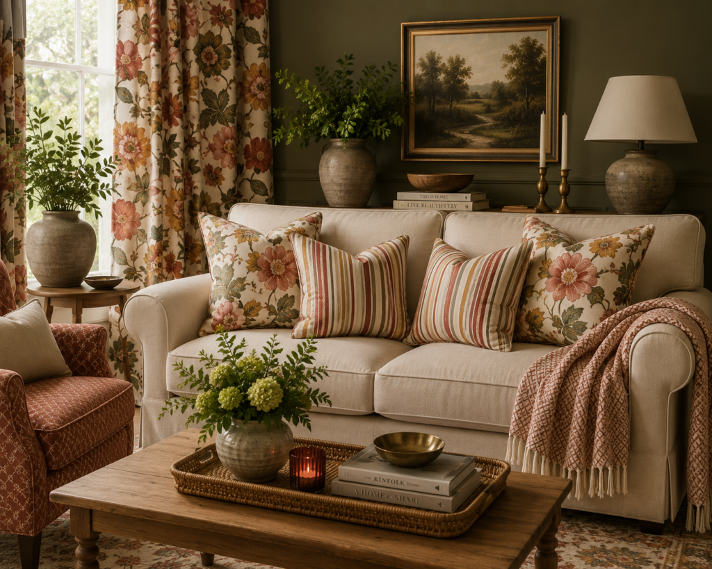
The easiest way to successfully mix patterns is by choosing a consistent colour palette.
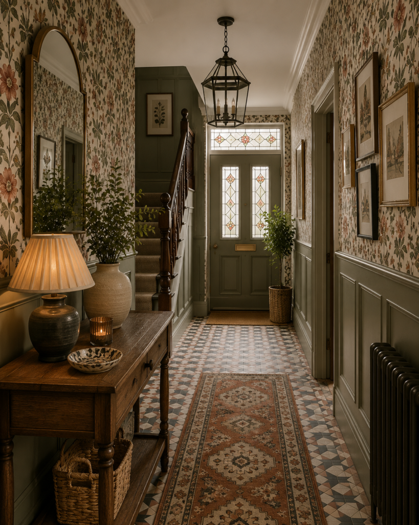
Rather than selecting fabrics and wallpapers purely because you like them individually, look for a common colour that appears throughout each pattern. This immediately creates harmony, even if the designs themselves are very different.
For example, you might choose:
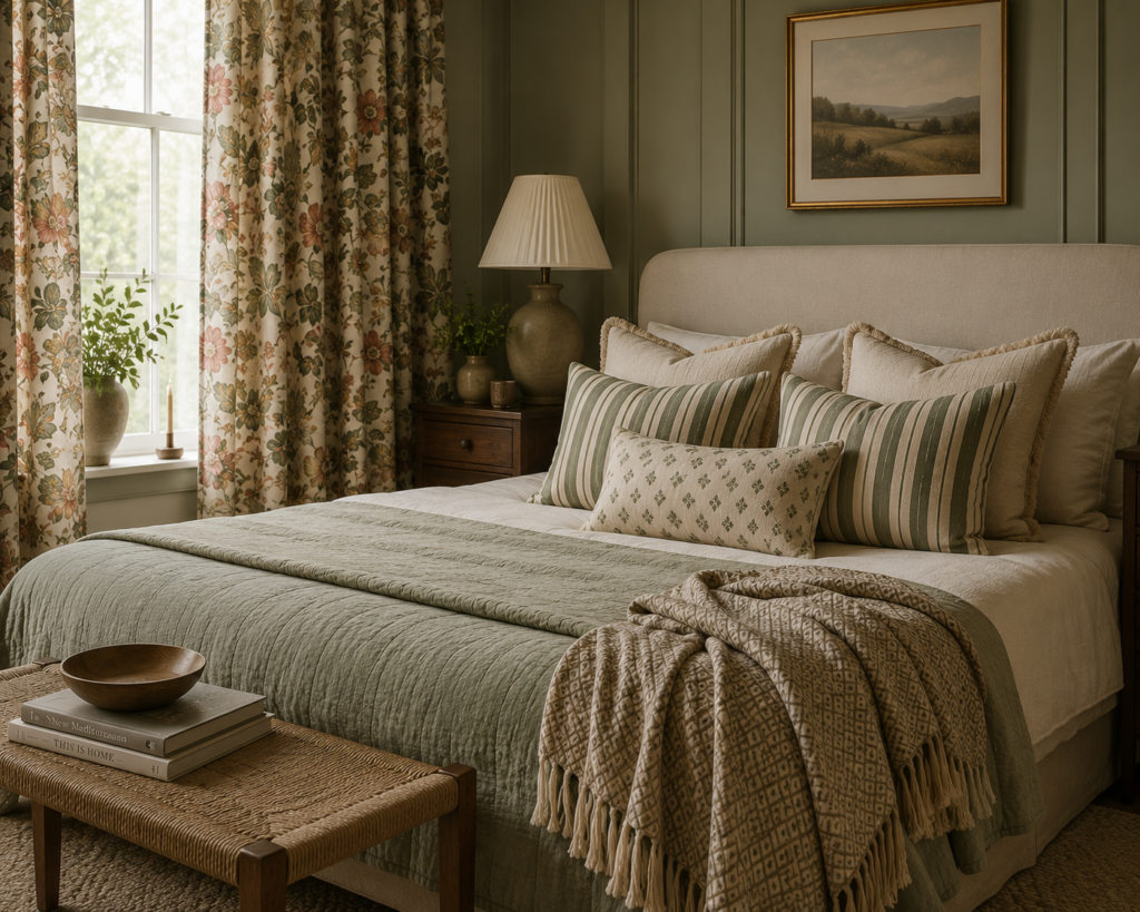
- Sage green as the dominant colour throughout the room
- A floral cushion featuring sage leaves
- A striped throw with sage detailing
- A geometric rug incorporating the same green tone
Because every element shares the same colour story, your eye naturally connects them together.
You don’t have to choose bold colours either. Neutral palettes using creams, taupes, charcoal, soft blues or warm browns can create just as much interest while feeling calm and sophisticated.
Designer Tip
One of my favourite tricks is to pick three to five colours for the room and repeat those colours throughout your soft furnishings, artwork, rugs and accessories. This creates a layered look that feels carefully considered rather than random.
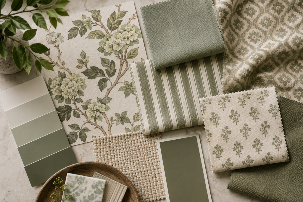
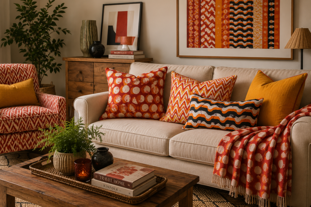
Choose Patterns with a Common Theme
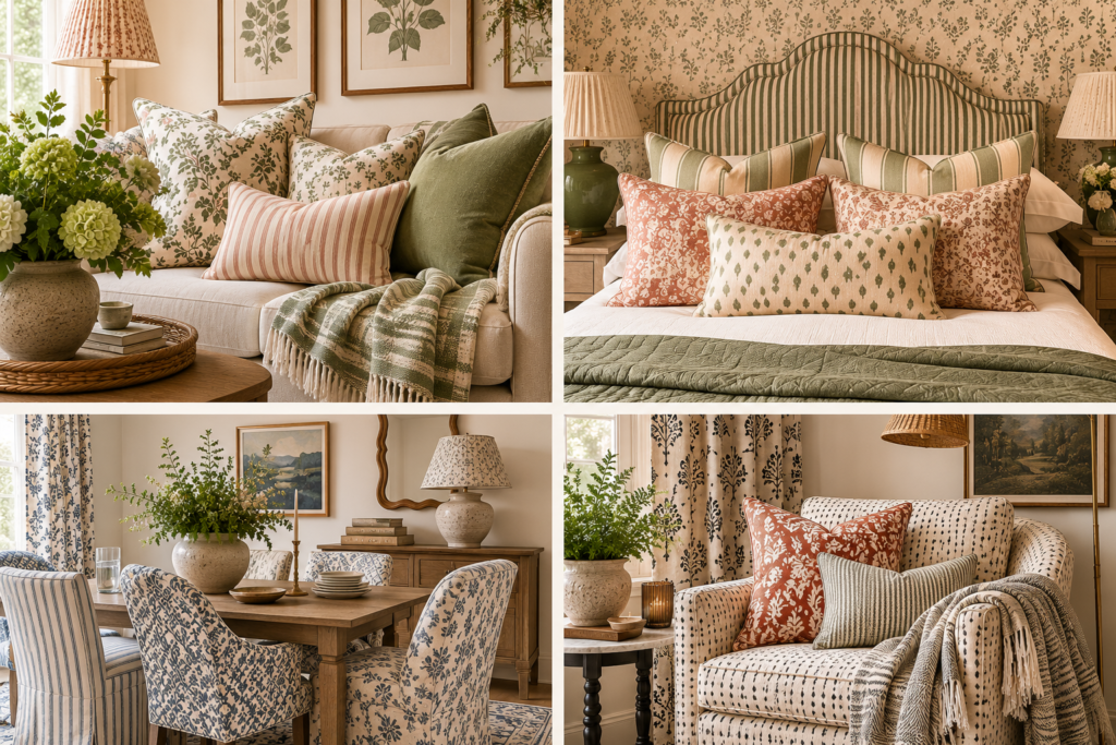
Patterns don’t all need to match—but they should feel like they belong together.
One simple way to achieve this is by selecting patterns that share a similar shape or style.
For example:
- Florals with botanical prints
- Stripes with checks
- Geometric patterns with chevrons
- Spots with circles
- Organic hand-drawn prints together
Keeping a common design language allows you to introduce variety without overwhelming the space.
Just as importantly, make sure the colours share a similar tone. Rich jewel tones tend to work beautifully together, while soft muted shades also pair effortlessly. Mixing bright primary colours with delicate pastels can sometimes feel disconnected unless carefully balanced.
Designer Tip
If you’re nervous about mixing patterns, choose one “hero” pattern you absolutely love, then find two or three simpler patterns that complement it rather than compete with it.
Mix Different Pattern Scales
One of the biggest mistakes people make is using patterns that are all the same size.
Imagine a sofa with five cushions, each featuring tiny, intricate prints. The overall effect can feel busy because your eye has nowhere to rest.
Likewise, using several oversized statement prints together can make a room feel overwhelming, as every pattern is competing for attention.
Instead, combine different scales.
A simple formula is:
- One large-scale pattern
- One medium-scale pattern
- One small-scale pattern
For example:
- Large floral curtains
- Medium striped cushions
- Small geometric throw
This creates rhythm and balance, allowing each pattern to stand out without overpowering the others.
Designer Tip
Think of pattern scale like a conversation. Every design deserves its chance to speak—but not everyone should be shouting at the same time.
Pattern Combinations That Always Work
Not sure where to start? These tried-and-tested combinations rarely disappoint.
Florals + Stripes + Spots
A timeless combination that feels elegant and welcoming. The structured stripes help balance the softness of florals, while spots add a playful touch.
Geometric + Floral + Chevron
Perfect for contemporary homes. The clean lines of geometric patterns contrast beautifully with more organic floral designs.
Animal Print + Geometric
Animal print works surprisingly well as a neutral. Pair leopard or zebra prints with simple black-and-white geometric designs for a sophisticated, modern look.
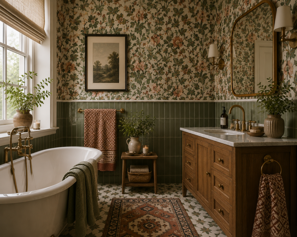
Damask + Florals + Stripes
Ideal for traditional or country-style interiors. Layering these classic patterns creates a luxurious and characterful space without feeling dated.
Common Pattern Mixing Mistakes to Avoid
Even beautiful fabrics can feel overwhelming if they’re not balanced correctly. Here are a few common mistakes to watch out for:
Ignoring texture: linen, velvet, wool and woven fabrics all add depth without introducing another pattern.
Using too many competing colours.
Choosing patterns that are all the same scale.
Introducing too many different pattern styles in one room.
Forgetting to include plain fabrics or solid colours to give the eye somewhere to rest.
Bringing Everything Together
Pattern mixing isn’t about following strict rules. It’s about creating balance.
By keeping a cohesive colour palette, choosing patterns with a common visual theme and varying the scale of your prints, you can create interiors that feel layered, welcoming and professionally designed.
Remember, your home should reflect your personality. Don’t be afraid to experiment with combinations you love. If something feels slightly unexpected but still balanced, it’s often those choices that make a room truly memorable.
Need Help Pulling a Room Together?
Choosing colours, fabrics and patterns can feel overwhelming when you’re trying to visualise the finished result.
At Starting Today Interiors, I help homeowners create beautifully balanced spaces with personalised colour schemes, furniture sourcing and practical interior design advice—all tailored to your home and your style.
Whether you’re refreshing a single room or planning a complete makeover, I’d love to help you create a home you truly love.
Explore my interior design services or get in touch to start your project today.